BVC 5 - Customer Choices
Customer choices are customizations/choices that a customer specifies when purchasing
a product. For example, if selling T-Shirts, the customer needs to specify the size
of the shirt. The shirt size selection is a customer choice. When creating a new
customer choice, there are five options to control the display of the choices to
the shopper: Text Input, Drop down List, Image Radio Button List, Radio Button List
or HTML Area.
When adding a new choice, you have the ability to select from Product Choices, Product
Modifies and Product Inputs.
- Product Choices: Product Choices are much like “new” products. When this choice
option is ordered, it will deduct items from its own inventory and not from the
product which it is attached.
- Product Modifiers: Product Modifiers allow you to adjust the main product from which
it’s attached. Modifiers will only modify the main product. When a “modifier” is
ordered, the inventory will reduce for the main item.
- Product Inputs: Product Inputs include HTML Area’s and Text Input boxes. Use the
HTML area to display custom HTML on the product page. Use the “Text Input” to request
input from the customer. Perhaps for custom engraving or embossments.
To create a new customer
choice, select the “Customer Choices” link in the left menu of the edit product
page.
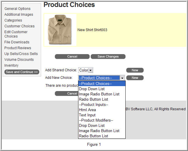
As displayed in Figure 1 above, you have two available options for adding choices
to a product; “Add Shared Choice” or “Add New Choice”.
"Shared Choices" are customer choices that can be templates for use in other products.
Example: Instead of manually creating the same sizes drop down list for shirts,
you could create one shared drop down list and use it throughout your product catalog.
Shared Choices can be configured under Catalog > Shared Choices.
In this example, we’ll create a standard (non-shared) drop down list for shirt sizes.
We’ll use the “Product Choices” drop down list and not the Product Modifier drop
down list.
Select “Drop Down List” under Product Choices in the “new choice” drop down menu.
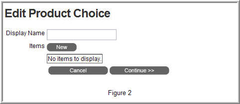
The “Display Name” will appear next to the drop down list on the store. In our example,
we’ll type “Sizes” into our Display Name.
Select the “new” new button to add size options to our “Sizes” drop down list.
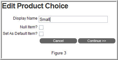
The “Display Name” will represent the name listed in the drop down list. You can
also set this as the “default item”. This will make this item the default option
in the drop down list. The “null item” option allows you to enter in descriptive
text that the customer cannot order. Example: You could use this to display “Please
Select a Size” or “Please Select One”.
After entering your “Display Name”, select the “Continue” button.
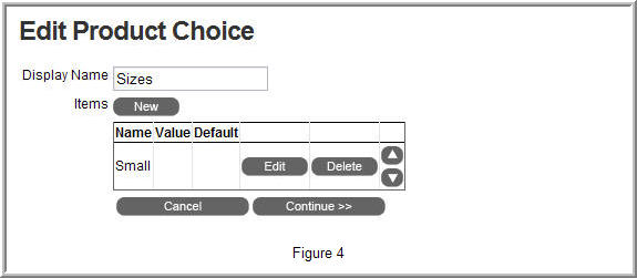
The next screen will display your option with the ability to edit, delete, or move
the item up or down within the drop down list.
Click the “new” button again to add more items to the drop down list.
Once completed, select the “continue” button at the bottom of the page.
The screen displayed in Figure 5 should appear. This screen will include all of
the choices created for the product. From here you can edit, delete or move your
choices up and down on the page using the arrows buttons.
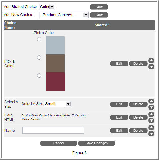
From top to bottom, we’ve included an image radio button list named “Pick a Color”,
a drop down list named “Select a Size”, an HTML area named “Extra HTML”, and a Text
Box named “Name”. This will ask the customer to specify a color, size, and allow
them to input customized embroidery.
Click the “Save Changes” button.
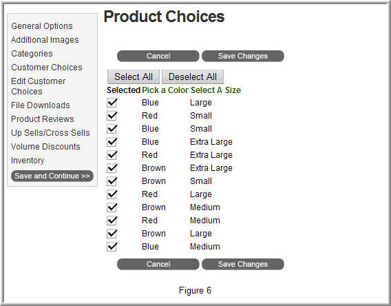
The next screen (pictured below) displays all of your choice combinations. Each
choice combination is created as its own product. In our example, we created a drop
down list of sizes and an image radio button list of colors. Each combination creates
its own product. From this screen, we can enable or disable the combinations. Select
the “Save Changes” button once completed.
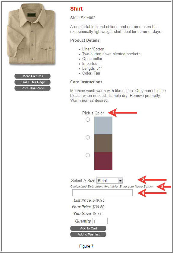
Let’s view our product in the store:
|
1 |
Displays our Image Radio Button List. The Image Radio button list has an image property
that allows us to specify a custom image. |
|
2 |
Displays our Drop Down List with size options. |
|
3 |
Displays our HTML Area choice with some text modified with HTML. |
|
4 |
Displays a Text Area that offers the ability for customer input.
|